It’s been a little over six months since I’ve written here, but since I’ve finished my intellectual hibernation with the coming of Spring, I should be able to post more often.
This semester I’m only taking one Education class, called Current Technology Trends. In the class we explore different tools that educators might find useful when teaching or creating materials. The university I work at and attend has a deal with Adobe, so the professor wanted us to create a photo collage in Adobe Spark with our nominations for the “Good EdTech Awards”. Since I try to use Open Source products as much as possible, I went to DuckDuckGo and searched for something like “alternative to Adobe Spark.” and it gave me a list of similar products, including Polotno Studio.
It’s very rare that I recommend a piece of software without reservation. Usually there is some sort of quibble, such as being too expensive, not open source, unfriendly to users, and so on. Polotno Studio is something I recommend wholeheartedly. The software is free and available on Github, but the Polotno Studio website puts the software in action and it’s simply wonderful. It’s easy to use and when you create an image you can download it without paying for it. It’s yours! You can eve use Polotno Studio without needing to create an account or give them an email address.
For the “Good EdTech Awards” project, I knew I wanted to do Duolingo since I’m a huge fan. When I do the lessons and come across a funny entry, I normally take a screenshot of it on my phone. I went through them to find ones that were approximately the same size and uploaded them to Polotno Studio, and from there I moved them to the project. I added some text, changed the color of the background, and voilá; a new infographic is born. I downloaded it to my computer, then uploaded it to the LMS we use for class.

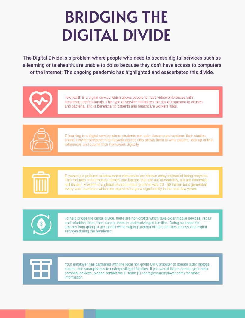
The second time I had an opportunity to use Polotno Studio came a few weeks later when we were finishing a module on the Digital Divide. The final assignment for the module was to create an infographic that explained the Digital Divide and some way of overcoming it. My idea was to explain what the Digital Divide is to university employees in the hopes of getting them to donate their old computers, tablets, and smartphones so they can be refurbished and given to families in need. To create the infographic, I used one of the templates in Polotno Studio, and customized it to make it more appropriate for my project.
Although Polotno Studio shows up in search engines as an alternative to Adobe Spark, it’s also a great alternative to the numerous logo design websites. Over the past year or so I’ve tried a bunch of them, and they work very much like Polotno Studio, except when the logo is finished they require payment, either as a yearly subscription, or a cost for high-resolution versions of the logo you created. It’s ridiculous. Now that I’ve found Polotno, I’ll never look back.
For the class projects, using Adobe Spark wasn’t as important as creating images that could be submitted, and since there are open-source alternatives to Adobe Spark, I decided to give one of them a try. Polotno Studio is easy to use, and can be used free of charge. I highly recommend it as a way of creating interesting looking infographics or logos quickly and easily.
